Thursday 26 November 2009

THE 100 CLUB Y'ALL


1 week to capture 100 examples of a subject or object. I've chosen to photograph a cross section of shop shutters across London. Look a little deeper and i found there's actually a very nice photographical quality to them. Uniformed yet individual, full of character and most importantly a strong shape compositionally. In order not to make it too easy for myself i decided that i would only include what i would call the 'classic' shutter, no chainlink security systems or mesh shop fronts would be acceptable. I had to work late in order to catch my subject down and because i was visiting locations right across the city this meant that i often found myself in spots i diddn't really want to be hanging out so late and with my slr. Everything was cool overall bar a couple potential near misses
Anyway, heres a few examples of my shutters before they get used in the project


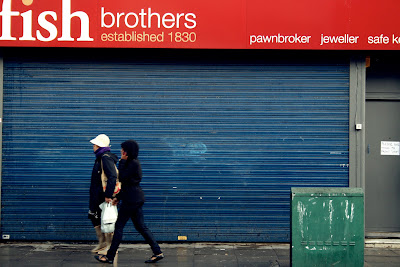
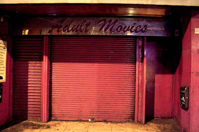


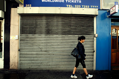


I really enjoyed doing it and would love to set myself another personal project like this in the future. If you try and keep all the images uniformed in their composition and style the repetition of an image can be really effective.
WORD

EXCUSES*

Originally i was going to design an oozing slime font which would pay homage to the great b movie classic poster designs of the 50's.


But after thinking a little more i decided i thought it was a little obvious and ultimately went in another direction with it. The original idea was much better.


I worked on a new piece which was inspired by the idea of sinking in quicksand, realised from a great archive of pictures taken during a climber and amateur photographer's travels in the 70's. (above)
The warm colour palette of the image appealed me and i wanted to involve it in my excuse. I used the type Britannic Bold for my excuse but unfortunately although i liked how it looked, using an existing type like this and just editing it wasn't really answering the brief properly.

Sunday 8 November 2009

THE WAR BETWEEN TYPE AND IMAGE


Our group produced work for an exhibition of monochrome A1 prints. The theme of the pieces was to convey the "war between type and image" through design. This wasn't to explore the relationship between them working together, rather the battle they wage against one another.


I wasn't overly satisfied with my own efforts and would have liked to have approached it quite differently with more of a compositional plan. But i thought the overall standard from everone was impressive, a really strong body of work. Due to the contrasting black and white imagery, the subject matter and the clean white walls of the exhibit space the room had a powerful atmosphere..

Check some pictures from the exhibition