Wednesday, 2 December 2009

THE ONE HUNDRED CLUB*

Created this layout using indesign. Found the program a bit confusing so for now i just kept it simple cos i couldn't do much more than the guide outlined. It'll take a bit of practice but i'll get the hang. I used a dark blue from the shutters for the boarder and type as you can see, i thought it tied fairly well with the hundred shutter pictures overall and wasn't too distracting. I really need to see this printed up before i have a sense of it working or not. Right now it just says postcard, dont know if that could be a good thing or what


Thursday, 26 November 2009

THE 100 CLUB Y'ALL


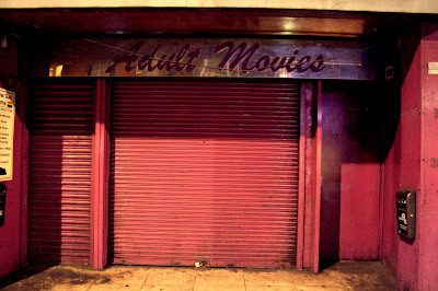
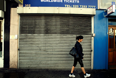
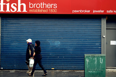
1 week to capture 100 examples of a subject or object. I've chosen to photograph a cross section of shop shutters across London. Look a little deeper and i found there's actually a very nice photographical quality to them. Uniformed yet individual, full of character and most importantly a strong shape compositionally. In order not to make it too easy for myself i decided that i would only include what i would call the 'classic' shutter, no chainlink security systems or mesh shop fronts would be acceptable. I had to work late in order to catch my subject down and because i was visiting locations right across the city this meant that i often found myself in spots i diddn't really want to be hanging out so late and with my slr. Everything was cool overall bar a couple potential near misses
Anyway, heres a few examples of my shutters before they get used in the project


I really enjoyed doing it and would love to set myself another personal project like this in the future. If you try and keep all the images uniformed in their composition and style the repetition of an image can be really effective.
WORD

EXCUSES*

Originally i was going to design an oozing slime font which would pay homage to the great b movie classic poster designs of the 50's.


But after thinking a little more i decided i thought it was a little obvious and ultimately went in another direction with it. The original idea was much better.


I worked on a new piece which was inspired by the idea of sinking in quicksand, realised from a great archive of pictures taken during a climber and amateur photographer's travels in the 70's. (above)
The warm colour palette of the image appealed me and i wanted to involve it in my excuse. I used the type Britannic Bold for my excuse but unfortunately although i liked how it looked, using an existing type like this and just editing it wasn't really answering the brief properly.

Sunday, 8 November 2009

THE WAR BETWEEN TYPE AND IMAGE


Our group produced work for an exhibition of monochrome A1 prints. The theme of the pieces was to convey the "war between type and image" through design. This wasn't to explore the relationship between them working together, rather the battle they wage against one another.


I wasn't overly satisfied with my own efforts and would have liked to have approached it quite differently with more of a compositional plan. But i thought the overall standard from everone was impressive, a really strong body of work. Due to the contrasting black and white imagery, the subject matter and the clean white walls of the exhibit space the room had a powerful atmosphere..

Check some pictures from the exhibition


Sunday, 25 October 2009

BRAND ME UP BUTTERCUP.


Design for the branding of Joe. Having trouble with ideas but I've done this so thought I'd post it. May well change this before I take it to print.
Focusing on Joe's personality trait of wanting to be the excel/be separated from the average I've put together this little logo. The three bars represent the normality or the crowd with the furthest right just hovering slightly above the others.
-JOE I MEAN NO OFFENCE BY THIS!-
Didn't really know what shapes would work well as representing humans, i played around with a few shapes but i thought these bars were the most suitable. But i wanted them to have some texture, so i scanned in a section of printed type and used that. I thought these rough bars had a more human aspect to them rather than using a clinical straight line drawn on the computer. Hopefully this should be effective when printed up at A2.

Saturday, 24 October 2009

Bit of this bit of that

Exercise in some basic design, at first incorporating type with image under a time constraint. These mostly focused on composition and balance of space. Then concentrated on some fonts. Had a bit of trouble with working at the rate we were supposed to and still keeping it neat, some of my letters are really wonky. This is something i need to improve, I'm just really used to working at my own pace..
The next page we did was a collection of three words taken from the "war words" list and the idea was to design the font in some way to get across the meaning of the word. Again some slightly wonky typo! Finally we injected character by adding dynamic pictures to the design while working fast and under impulse. Tearing out/ripping up the page was encouraged to emphasise the subject matter. Some dope work was produced by everyone..


Thursday, 22 October 2009

YO JOE PLEASS?

Page of scribblings from part II of the Brand me up Buttercup task. Idea here is to try and symbolically brand this matey in my class in the medium of a reductive, graphic logo. Its quite a fun but difficult thing to analyse a person's character and then translate it into a piece of graphic design, the most tricky bit being trying to decide what one thing it is which defines them.


Wednesday, 21 October 2009

playing cards

Quick design for a card which had to include a pictue of some guy, his name and student number.
Looks a bit gay, but had trouble finding a better image..


Thursday, 15 October 2009

Brand me up Buttercup

Little trip to the Museum of Brands, Packaging and Advertising.
The ultimate nostalgia trip neatly situated in Notting Hill.
Well good place..


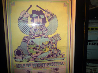
Took some pictures of some personal favourites and iconic brand identities, if you search theres some real gems hidden away. Also did some sketches of packaging graphics which caught my eye..


My cameras battery died pretty quickly so most of these were taken on my phone unfortunately..