"The word that best defines Robert Rauschenberg’s achievements as a painter, printmaker, photographer, sculptor, theatre designer, performance artist, and technologist is - epic."
Robert Rauschenberg was born in 1925 in Texas to fundamentalist Christian parents. He served as a U.S marine in the second world war before deciding to go study art at the Kansas city art institute. The following year he moved to Paris to further his studies at the Academe Julian where he met his wife and they later continued to study at the Black Mountain school of art.
A few years later, he travelled across Europe and north america with the woman he was having an affair with. on their travels Rauschenberg created a series of collages and arrangements, these included boxes filed with found objects. When he returned to america he began work on his 'red paintings' which were painted newspaper and patterned textile on canvas. The same year he met artist Jasper Johns, who was very influential in his combine works. Later, Rauschenberg began experimenting with transfer paper, lithographs and various other printing techniques to create his combined masterpieces.

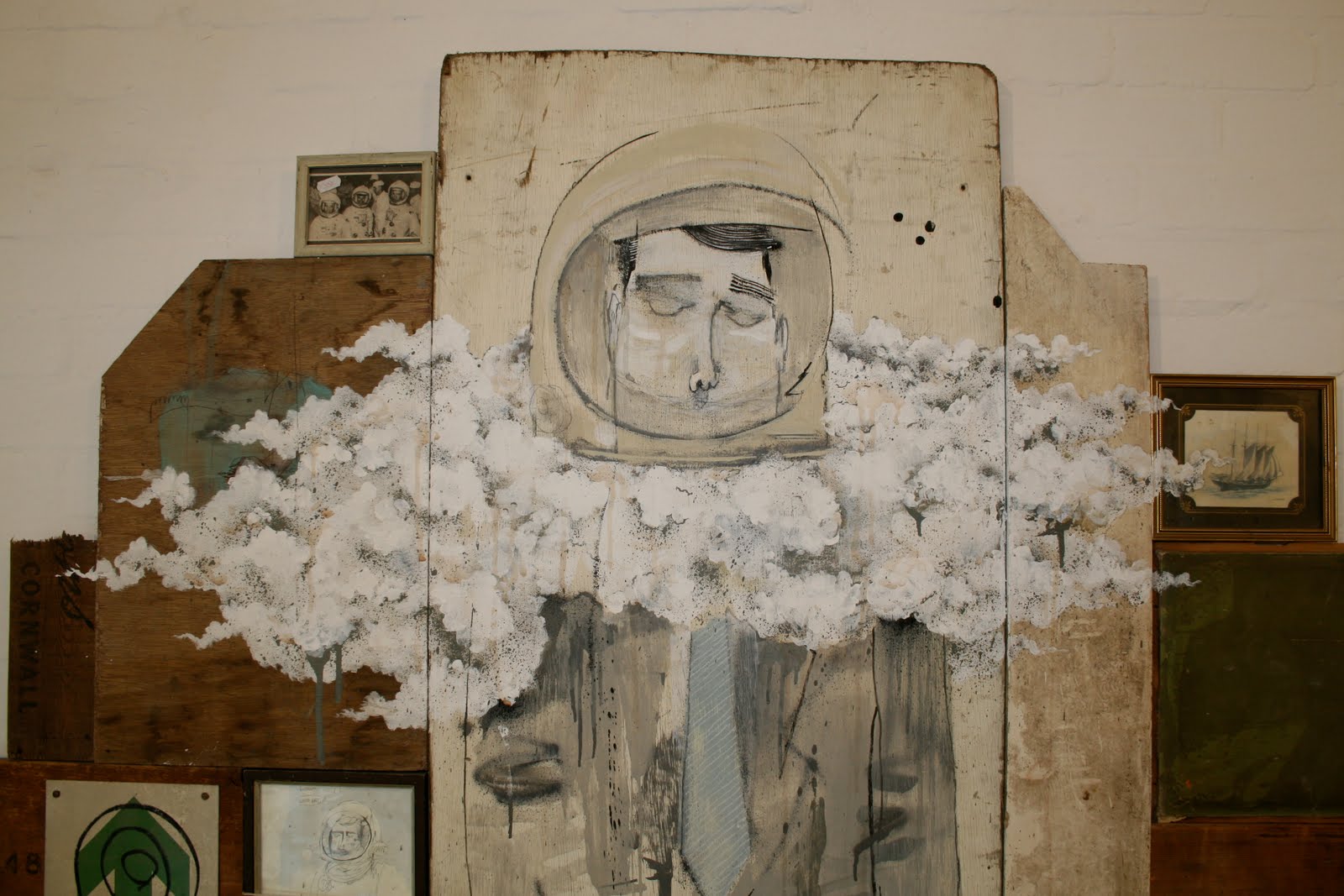
For me, Rauschenberg is a huge inspiration in my work. So pioneering in his practice to really push the concept how pieces could be created by integrating different disciplines in art like sculpture, painting and collage. I particularly enjoy the series of work which most encompasses this, the Combines. Here, sourced materials such as old furniture, paper and everyday items alongside painstakingly created objects were were used as a canvas on which to create stunning excercises in perfect composition. Heavy brushstrokes and areas of block colour seem to piece together perfectly and effortlessly, each element complimenting the next. He really enjoyed the process of creating his collages and paintings, with its freedom in the apparent simplicity of execution. What i find genius is how he has made them look often so whimsical in the arrangement of the different blocks and spaces, what at first glance can look Like a mess, when in fact they are highly balanced and precision placed. Key ingredients which make up a stunning end result. His subtleties in colour change and desaturated palette is so aesthetically interesting when laid on to the textures of these rough wood structures and surfaces.